4 - Basic Shading
This article was supported by Patreon! If you like what I’m doing here, please consider supporting me there :) Also, this is the part 4 of a series of articles, read the whole series here.
This article is a little longer and text-heavy than the previous ones, so buckle up!
How light works
We see things because of light, and when we draw something we are actually trying to represent how the light reacts to that object. Even if you haven’t studied this before, you already know how light works, you see it every day: it bounces off some materials and occasionally refracts to others.
One less obvious aspect is that the angle at which the light hits the object also matters, a perpendicular light is darker than a direct light.
You need to try to simulate that light behavior in your head, almost like you are a human rendering machine. Since that’s very hard and prone to errors, a good way to study how light works if to use photo references. Photo references are a great thing, you don’t need to necessarily copy the photo, but you can use it to understand how the light behaves in that particular case. Using a photo reference is always a good practice and there’s no merit in not using one.
Basic structure
When shading an image it’s good to have a structure to follow, I’ll make a basic glossary with a brief definition of each term.
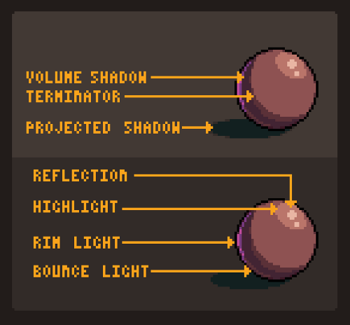
Volume shadow: The most common type of shadow, it’s a self-projected soft shadow. It’s the result of the light being blocked by the object’s own volume. Terminator: It’s the transition zone between the light area and the dark area of an object. It can be soft or sharp. In pixel art we favor sharp transitions to avoid banding (more about that in the future).
Projected shadow: When one object projects a patch of shadow into another. This is usually a very sharp shadow.
Reflection highlight: Also known as specular highlight, it’s the brightest spot in the object. Glossy and reflective objects have small and focused highlights. Rougher objects may not have a reflection highlight.
Highlight: The basic lighter area of an object, imagine it as the reverse of the volume shadow.
Rim Light: When the light is coming from the back it looks almost like a bright outline. This is usually cast by a secondary, dimmer light.
Bounce Light: It’s a little hard to see sometimes but this is a slightly brighter spot in the volume shadow, caused by the light bouncing off the ground and back onto the object. By no means you need to memorize this, but if you are not sure on what to do on your painting, check this list. Another thing to keep in mind is that all of this will not even fit in most pixel art pieces, especially the lower resolution or the lower color count ones. As always, remember: good pixel art eliminates all unnecessary detail.
Working with a photo reference
Let’s do an exercise here, let’s try drawing this photo:
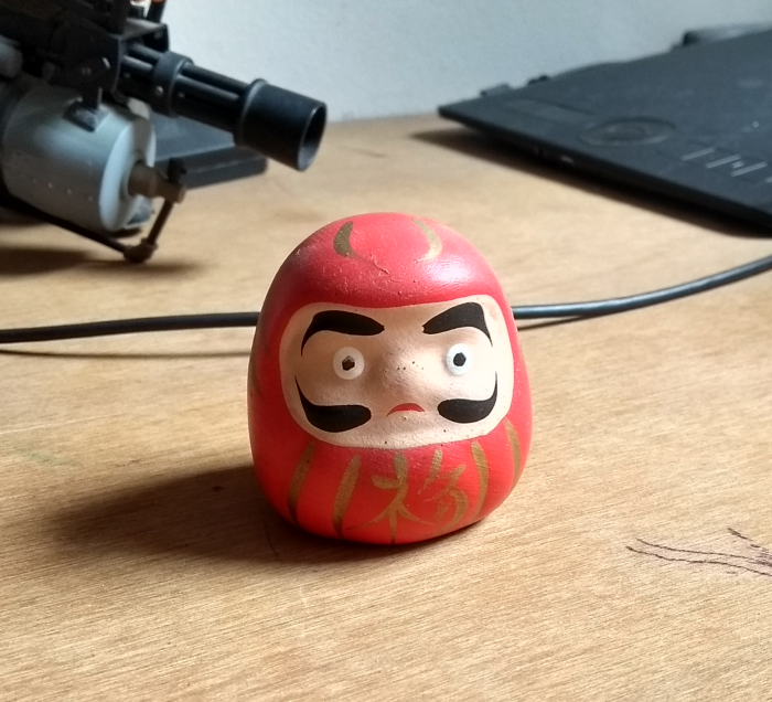
First, let’s start a new file, I’ll use a 48x48 canvas and I’ll use the AAP-64 palette. I encourage you to take a picture of something simple and do the same, or just use this one. Try to follow my steps.
Like in my previous tutorial, I’ll work with big clusters of color, trying to emulate how the light behaves in the photo. Here’s my whole process, and a resized version of the photo:
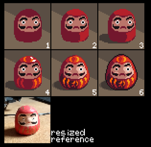
As you can see I took a lot of liberties in my design, I changed the pose a little, removed the specular highlight and made the Daruma a little more like an egg. The main reason here is that we don’t want the drawing to look like a resized photo, we need it to look better, so I made adjustments so it would be more readable and look more interesting.
I focused on the details that I think are important. Since we’re working with such a low resolution, some details must not be included while some others need to be highlighted. Look at the resized mouth, it’s barely there, I made it bigger and more noticeable, because it’a an important detail. Same with the eyes, they are now bigger and regular.
Let’s go step by step:
-
Start with the basic colors and shapes, I like to start with the darker colors and paint the brighter ones later, but that’s a personal preference.
-
Paint the basic light/shadow inside the object, keep your color count low for now.
-
Draw projected shadows.
-
Draw the details, engravings and other small parts.
-
Correct the shapes, reinforce the shadows and highlights.
-
Finish up with some extra anti-alias and outlines, if necessary.
If you’re still not happy with your drawing, don’t worry, go at your own pace and keep practicing. Try drawing something simpler and focus on eliminating unnecessary details.
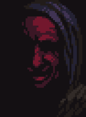
Identifying Faces
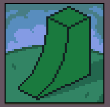
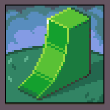
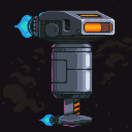
On our next drawing, let’s try something different. You will work on shading this image:

Again we will use the AAP-64 palette and a 48x48 canvas. The idea here is to illuminate the scene properly. The main difference of this and the other image is that this one has mostly flat faces and the other is round.
Flat faces usually have a uniform color in their entirety while rounded shapes can have color ramps. Flat faces can have ramps if the color is not very strong or if the object is too close to the light source, but I would avoid that when possible, or keep the variation to a minimum.
With that in mind, choose a light direction and paint our sprite. Then come back here to check how I solved this and see some common mistakes. I didn’t put a light source in the sprite because this is something you need to practice too, choosing a good light source is a skill as important as rendering the scene correctly.
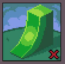
My version
The first thing I did was the background and the projected shadow, this will help me set the tone for the whole image.
After that, I tried to set the color for each face: the top and side faces should have uniform colors, the slope can have a gradient. I only used two colors because I want to keep it simple and the banding effect (more on that on part 5) to a minimum.
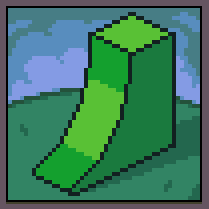
The next thing are those outlines, they were bothering me a lot. So I tried to imagine them as other tiny faces, softening the shape a little.
Now the contrast was a little too low, so I added a small specular highlight and deepened some of the shadows. I also added some cheap dither to make the slope transition a little better.
Common Mistakes
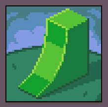
Here’s some of the common mistakes when shading an object, so try to identify if you are doing any of these things. Also note that the examples here are exaggerated, and this can happen in smaller amounts in your drawing.
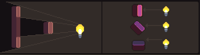
Soft faces
This usually happens when trying to soften the light on the object a little too much or in the wrong direction. Flat areas should have mostly uniform colors and curved areas should only change the color in the direction of the ramp.
Pillow shading
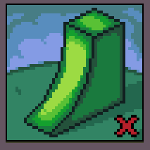
This is a famous one, it happens when trying to shade an object with no clear light source and making a generic shadow around the outlines. This is best avoided by having a clearer light source and not darkening the edges of a face.
Flat light
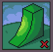
Another common mistake is to ignore the actual shape of the image. Remember that your object is a representation of a 3D object. If you’re not sure of how light should behave, try researching or even making a photo reference.
Now What?
Don’t forget to look around you. When walking on the street, pay attention at how the light shines on buildings, how it shows through your fingers. Nothing will teach you more about light and shadow than exploring the details you see everyday.
Good luck!
Keep reading the part 5 here!