5 - Anti-Alias and Banding
This article was supported by Patreon! If you like what I’m doing here, please consider supporting me there :) Also, this is the part 5 of a series of articles, read the whole series here.
This is a slightly more complex theme, so the article will be a little longer and more advanced than the others. Don’t worry if you don’t understand it all at first, a lot of it is very subjective and opinions about anti-alias and banding differ vastly in the pixel art community.
I won’t go into software at first but focus on exploring and explaining these concepts. In the Now What? chapter I’ll recommend some exercises.
What is alias and why people don’t like it
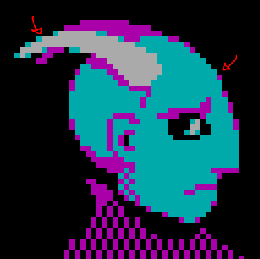
When we say alias in pixel art we are usually talking about jaggies, or the staircase effect. An effect that’s mostly noticeable in lower resolutions. This effect is not necessarily bad by itself, it can even be used on purpose depending on the art style you are aiming for, but sometimes it can cause the image to become very hard to read.
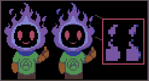
As you can see in the example above, the first image has some very sharp edges, especially around the fire. In some areas it’s even hard to understand what’s supposed to be going on in there.
This happens because pixel art is a low resolution representation of something. If you think like this, it’s possible to separate an “intended line” from the actual pixels.
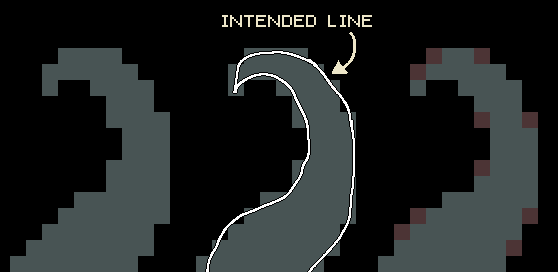
Basically the whole pixel art process consists in translating that intended line into the lower resolution of the canvas and deciding which pixels to fill. Some pixels are obviously inside the our lines so they get filled, some are clearly outside so they don’t. The problem is that some pixels just barely touch the line or are half filled, those are the problematic ones. Anti-alias is the process of using a color in between to fill some of those pixels to create the illusion of a softer transition.
How can we make anti-alias
Quick recap: sometimes we need to represent a line or curve that doesn’t fit in our pixel grid, so we use semi-tones to make them look better.
There’s no single solution for this problem, you can solve your “intended line” in many ways, depending on your resolution, art style and how many colors you have available.
The theory is that a pixel with a mixed color halfway counts as a half pixel when zoomed out. You can use those to try to round those pixel edges a little.
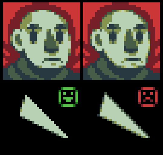
A good method for making anti-alias is to search for any staircase pattern that’s longer than one by one pixels:
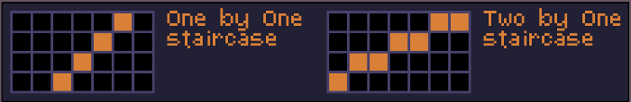
After identifying the pattern with steps two pixels or longer you can start to soften them, by adding a halftone in after the step ends. The amount of pixels you should fill depends mostly on the length of the step and the available colors. Sometimes this can make the object expand too much, to compensate for this you can use the halftone to “eat” one (sometimes more) pixels from the actual original shape.
Note that changing the color hue or saturation doesn’t matter too much, as long as you are interpolating the color values correctly. This is specially useful if you are working with a very small palette.
This is already complicated when working on simple slopes, and when working on real drawings it gets exponentially more complex. On a small canvas, anti-aliasing one object can affect another in weird ways and create a lot of side effects. Let’s talk about some common ones.
Too much anti-alias
The most common mistake is when the anti-alias is overdone causing a blurry effect. Avoid this by using fewer color halftones, fewer steps and do not use anti-alias in 45 degree lines (one by one steps) or in straight lines.
Anti-alias is too short
This is less common and can be done on purpose, specially on limited palettes, but sometimes the anti-alias halftones are too short in comparison to the length of the step. Always remember that a long step should have a proportionally long anti-alias halftone strip.
Wrong values on the halftone
I mentioned before that the halftone can have different hues as long as the value feels like a bridge between the two colors you are mixing. The problem here happens when that’s not taken into consideration, making the halftone too dark or bright in comparison with the background. Sometimes, when the background is lighter than the object, this can be used to emulate a shadow, which can work. Just remember that in that case you are not making anti-alias but just shading an object.
Banding
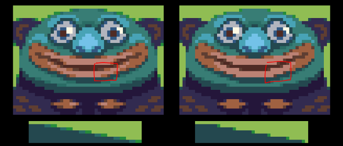
Banding happens when we have multiple color bands that are clearly distinct from one another. This is usually very problematic, making the object look flat and sometimes blurry. It’s very hard for a beginner to identify banding and I struggled with it a lot when I started making pixel art, but with practice you eyes will catch it really quickly.
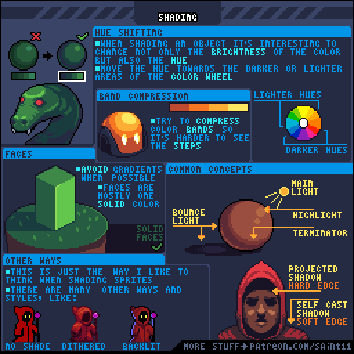
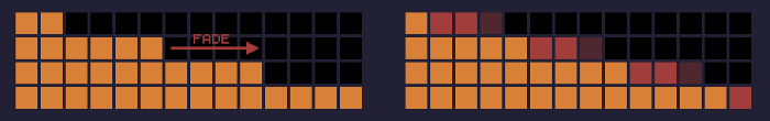
In the sphere example you can see that I compressed the bands into tiny areas. I call that technique, obviously, band compression, and I mention it in my shading tutorial.
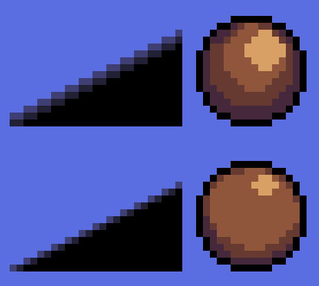
In the slope example, though, there’s no way you can compress those bands even more. So what I did was rotating the direction of the gradients. This will also create a nice anti-alias, which was initially made in the wrong direction, thus, causing the banding. Always pay attention to that, an horizontal slope should have an horizontal anti-alias and a vertical slope should have a vertical anti-alias.
Now what?
Now I would recommend you actually trying out the things I explained here. You can start with a simple 2 by 1 black slope, and then try a circle. Always keep your color count low and your file size no more than 48x48. After they are done you can try some colors and some actual drawing, I would start with something simple, like a sphere or an apple before moving on to more complex shapes, like people. Always look for banding in your images after they are done or points where your anti-alias could be improved. Remember that each pixel is a decision and each pixel should improve your drawing, making it more readable. If the anti-alias is doing more harm than good, just remove it.
Keep reading the part 6 here!